
This was a semester long research project under 2 members of the UX Research team at Home Depot. The goal of this project was to gain insights into the potential pain points Home Depot curbside employees face— specifically in the fulfillment and release of curbside orders. Through user centered research we were able to identify problems in the existing employee curbside process, and suggest a solution.
For this project I was a UX researcher and aided in the design process. Some of my roles included conceptualizing the problem space by meeting with our HD UX researcher stakeholders, as well as conducting research methods with Home Depot experts and employees to ensure user needs were being addressed.
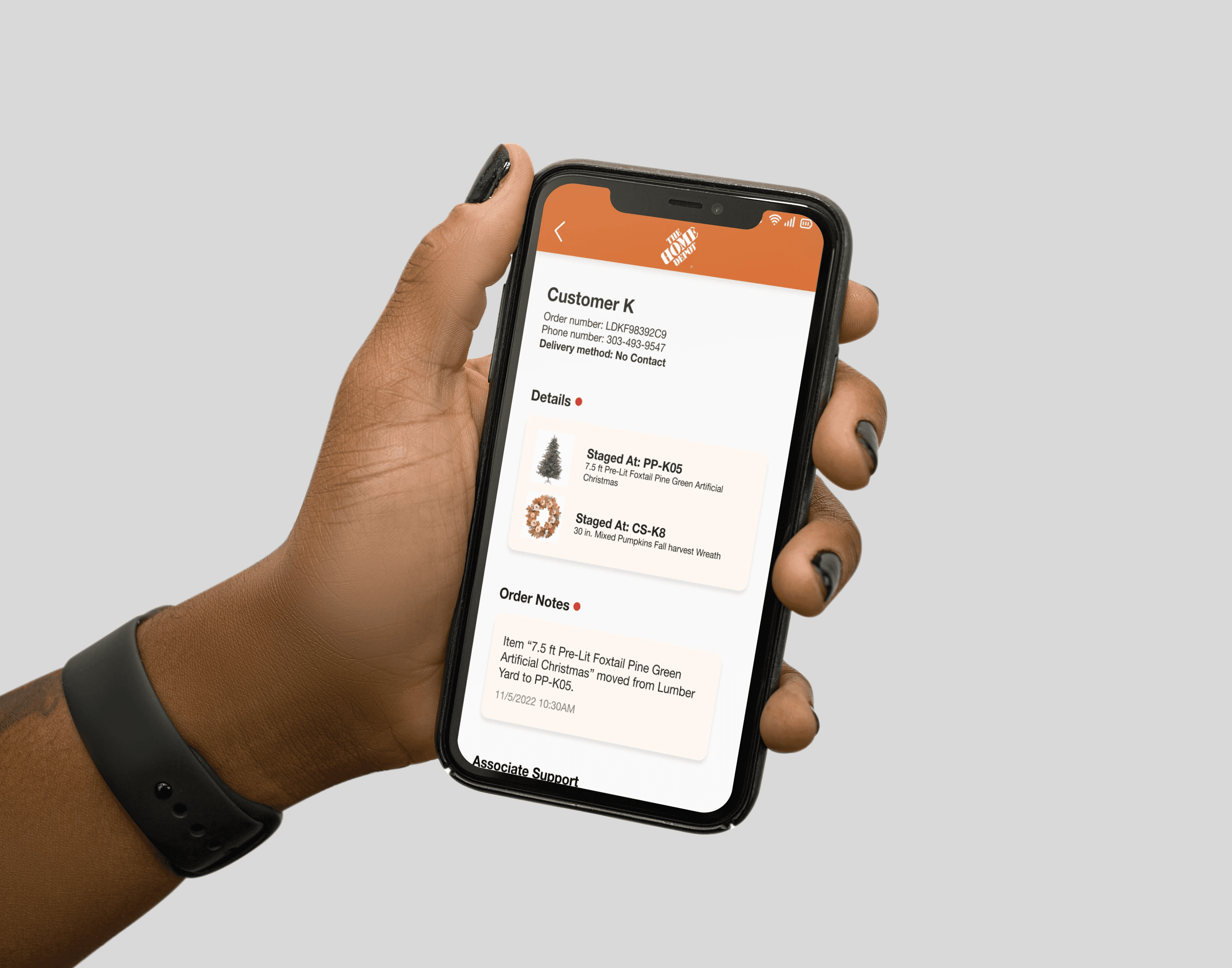
Our solution was a new Curbside App that provides sufficient notifications, gives access to all relevant information in one place, and promotes communication between employees.


The group first conducted a series of contextual inquiries to observe and interview employees as they completed curbside-related tasks in a daily context. This was done in order to understand which features of the curbside process could be improved upon, altered, or omitted to improve employee efficiency.
Team conducted 4 contextual interviews that lasted about 45 minutes each.
Participants (representative of every role in the curbside experience):
- Customer Service Experience Manager
- Service Desk Associate
- Curbside Associate
- Order Fulfillment Associate
In order to analyze data gathered during contextual inquiries, we created an affinity based on interpretation notes from each interview.
Thematic groups, represented by higher level statements on green sticky notes include:
- Job multifaceted and complicated
- There is a need for more transparent and standardized process
- The customer is important

Next, the group chose to conduct a task analysis with a Curbside Associate during one of our store visits.
Task: Curbside order retrieval and delivery to customer vehicle
We chose to conduct a task analysis because it allowed us to separate out each step in the current process and visually see which steps are difficult or unnecessary. Findings reiterated those found in the affinity model.

From the step by step walkthrough of the task analysis as well as the interpretations which emerged from our affinity diagram, we were able to compile 5 evidence-based insights from our primary research.

UA02-7 “misses notifications due to other tasks”
UA04-15 “new order alerts are not repeated”

UA04-2 “There are no explicit guidelines on where different types of orders need to be staged”
UA03-12 “Puts stuff where it fits on the shelf rather than organizing”

A CS reported that: (UA02-8) “Customers don’t always check-in when arrived”
An OFA reported that she: (UA04-21) “wishes for better communication with customer about order status”

UA03-1 “SDAs sometimes have to carry/deliver bulky or heavy items to customers”
UA02-5 “Trouble finding order puller’s extension to contact for help”

Not all employees are given access to a mobile phone and rely on desktop versions of the applications.
UA02-4 “Don’t have enough ‘First Phones’ for all”
UA01-17 “SDA can only cancel and refund curbside order on Order Up”
Based on our findings, we determined that the following were the most essential and practical design requirements to keep in mind during our ideation phase:
- Push multi-sensory notifications that reflect changes in curbside order status
- Standardize staging location and documentation
- Request support from other employees
- Simple and easy to use
- WCAG compliance (accessibility)
In order to design a solution that meets necessary design recommendations, the group held 3 brainstorming sessions then presented sketches as deliverables with our HD UX Research team. Additionally, we created several story boards to better contextualize how the user might interact with our solution in context. Finally, we chose the application which the team felt best met our design requirements: A new new Curbside App. The app was then prototyped using Figma.
Below is a storyboard that illustrates how the solution can be used in context
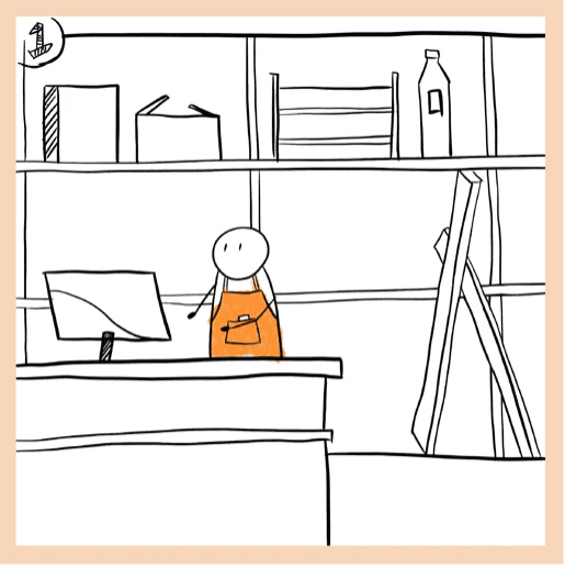

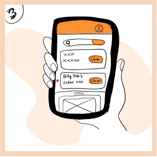
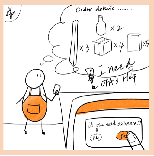
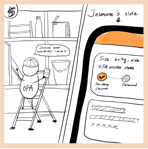

(Images drawn by team member)
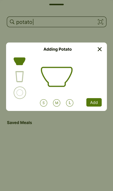
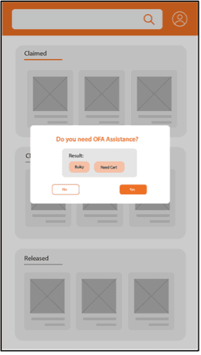
The following are images of low fidelity wireframe made in Figma. Our low fidelity prototypes acted as a tool to quickly outline our designs and communicate the ideas to our stakeholders for feedback prior to detailed prototyping.


The group then developed high fidelity prototypes in figma, with four separate user interaction flows. provides sufficient notifications, gives access to all relevant information in one place, and promotes communication between employees.


we assessed 4 main design requirements through a two-part evaluation.
Part one was a semi-structured interview to assess design requirements: “multi-sensory notifications”, “standardize and organize staging location,” and “allow employees to request assistance”
The second phase was a System Usability Scale to assess the design requirement “application is simple and easy to use”
The solution was evaluated in pairs of 2 and overseen by a facilitator and a note-taker. Participants were 4 classmates in the MS-HCI program. It should be noted that none of these participants have ever worked at the Home Depot, so they were not representative of our target user (this evaluation type was a requirement of the course).
The facilitator guided 2 participants through several benchmark tasks


Before we conducted our discounted evaluation, we presented our design solutions and walked through each user flows to Chandler and Stephanie (both THD UX designers) to receive general feedback. We mostly presented our ideas at each meeting and did not ask for critical feedback. If we could do it again, we would have used this meeting with THD designer more effectively by conducting expert usability tests. This would give us more effective data during the evaluation phase with their background knowledge and design experience.
Throughout the process, we utilized a variety of research methods to collect data (contextual inquiries with four Home Depot associates, observation of curbside order fulfillment process, associate interviews). However, as it stands, we have based our design on data collected from two store visits. If we could do this study again, I would spend even more time in store with the employees to better understand their day-to-day job.
Due to the limited time constraints, we only did discounted evaluation with our peer classmates. However, since they don’t have background knowledge about the process of curbside order, many of the terms and wording in our design are jargon for them. If we have more time, we will conduct evaluation sessions with the THD associates. This would reduce the interference from misconception and misinformation and give us more reliable data that targets the real usability problems for the associates.